Company
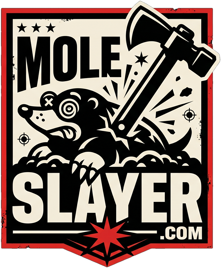
Mole Slayer badge
Company badge: an axe strike on a dazed mole, with MOLE SLAYER and .COM inside a red-bordered shield. It is the hero of the homepage and the logo in the site header.
Download PNG ↓The idea: heavy-metal pest control, played completely straight. Every other brand in the aisle whispers "humane," "deter," and "eco-friendly." Mole Slayer treats a molehill like a declaration of war and never winks. The joke only works if nobody admits it's a joke.
Illustrated badges for the company and its flagship product. Use them where there's room for detail: the homepage hero, the product page, packaging, stickers, patches, and merch. For small or one-color uses, switch to the vector marks below.
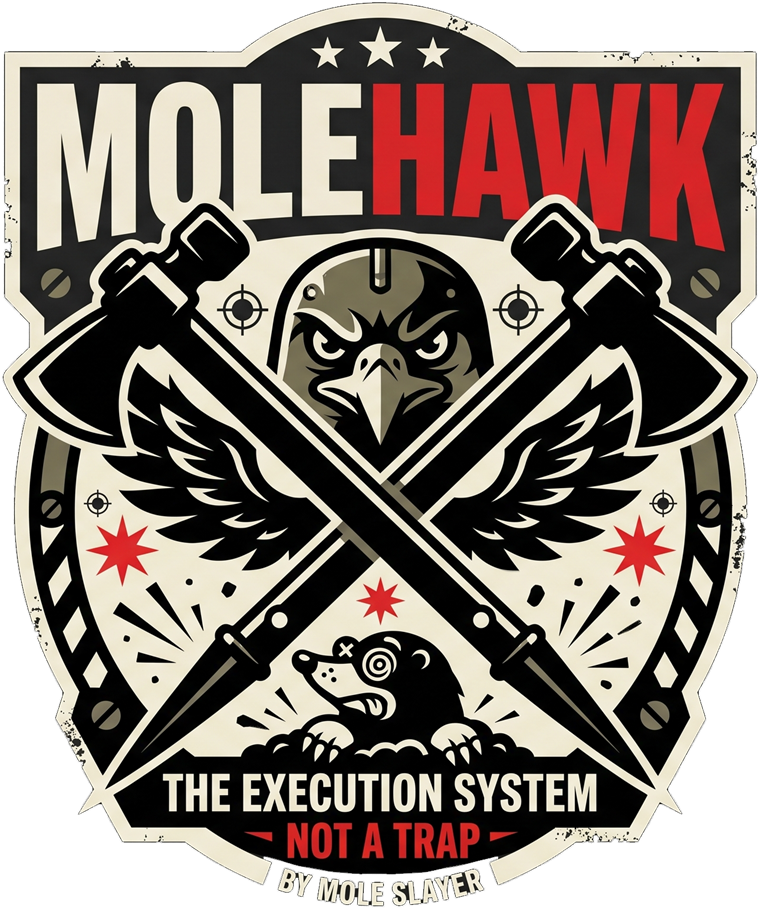
These are raster (PNG) files, cut out from the originals. Fine for web and small print. Before packaging, embroidery, or large signage, have them redrawn as vector art (SVG/AI/EPS).
80px wide on screen, 1" in print. Below that, the detail turns to mush. Use the skull Mark instead.
Grave Black or Fresh Dirt. Never on busy photos, and never inside another frame. The badge is already the frame.
One symbol, one primary lockup, and a set of supporting marks. Every file is fully outlined SVG, so no fonts are needed. Hand these straight to a printer, embroiderer, or Shopify theme.



Keep a margin equal to the height of the "M" in MOLE on all sides. The Mark alone needs a quarter of its width.
The Mark: 20px on screen, 0.3" in print. The Primary lockup: 140px wide. Below that, use the Mark only.
No chrome gradients, bevels, or drop shadows on the mark. No rounding. No recoloring outside the palette. Never show a cute, healthy mole. When a mole appears, it is clearly losing: X'd-out eye, spiral eye, tongue out.
Three more directions built on the same skull-and-Death-Stick mark. The Strike won and is now the primary logo. Each one comes in on-black and on-bone versions.
Mostly black, bone, and blood. Blaze Orange is a warning color: use it for hazard cues and alerts only. It also matches the field stake.
Backgrounds, packaging base, 60% of everything.
Type on black, light panels, product photo sweeps.
Primary action, accents, tagline bar, the "5".
Warnings, hazard stripes, safety callouts only.
Section grounds, packaging inner flaps.
Metadata, fine print, disabled states.
All five are free Google Fonts, so they port to Shopify without licensing headaches.
Write like a drill sergeant reading a pesticide label at a metal show. Hyperbolic about the mission, and accurate about the product. The comedy is the gap between the two.
All the violence is aimed at moles. Never at people, neighbors, or real-world tragedies. The enemy is four ounces of velvet.
Specs, safety, and legal copy on real products are 100% accurate. The jokes live in the framing, never in the claims.
No "lol," no emoji, no "just kidding." The fake products get a straight-faced satire notice, written in voice.
The primary line plus a bench of secondaries for ads, packaging flaps, and merch. The struck-through lines are retired, and the note explains why.
Products are lit like a loadout screen: hard light, deep shadow, a single subject. The world around them is dirt and steel.
Rough mockups to show how the system holds together on packaging and merch.